COVID-19 lockdown: air pollution in cities
Most of the nitrogen dioxide (NO₂) we breathe daily in our cities is generated by ourselves. It is generated in combustion processes such as heating and cooking, but most of the NO₂ in our streets comes from motor vehicle exhaust.
NO₂ is linked to an increased likelihood of respiratory problems. It inflames the lining of the lungs, and can reduce immunity to lung infections, paving the way for colds, flu and bronchitis. On people with asthma, it can cause more frequent and intense attacks. Children with asthma and older people with heart disease are most at risk.
This site reflects the work of Lobelia Earth and the Royal Netherlands Meteorological Institute (KNMI) on urban air quality during COVID-19 lockdowns.
License and credits ›Comparison of average NO₂ concentrations, before and during lockdowns
What do these interactives show?
A clear decrease in NO₂ concentrations in Madrid and Barcelona during the lockdown period. In the case of Madrid it seems clear that this decrease is due to the decrease in traffic. In the case of Barcelona, the NO₂ forecast was already very low for these days due to weather conditions. A detailed study is necessary to determine the contribution of traffic to this decline. A preliminary analysis can be found below.
Barcelona
Madrid
* These interactives will be updated daily.
Evolution of NO₂ concentrations before and during lockdown
Barcelona
Original data sampling rate is 1 measurement per hour. The time lapse shows a 48 hours moving average with a frame every 4 hours. The moving average intends to enhance the visualization of the global trend of NO₂ concentrations and won’t show the daily peaks.
Madrid
Original data sampling rate is 1 measurement per hour. The time lapse shows a 48 hours moving average with a frame every 4 hours. The moving average intends to enhance the visualization of the global trend of NO₂ concentrations and won’t show the daily peaks.
Preliminary analysis of the impact of lockdown regulations
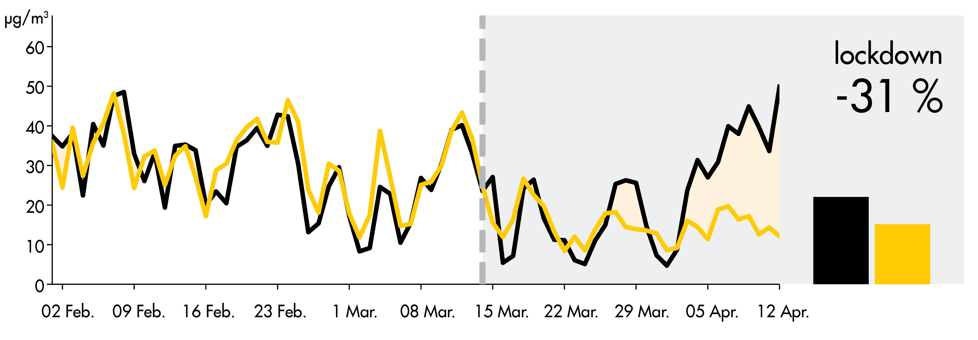
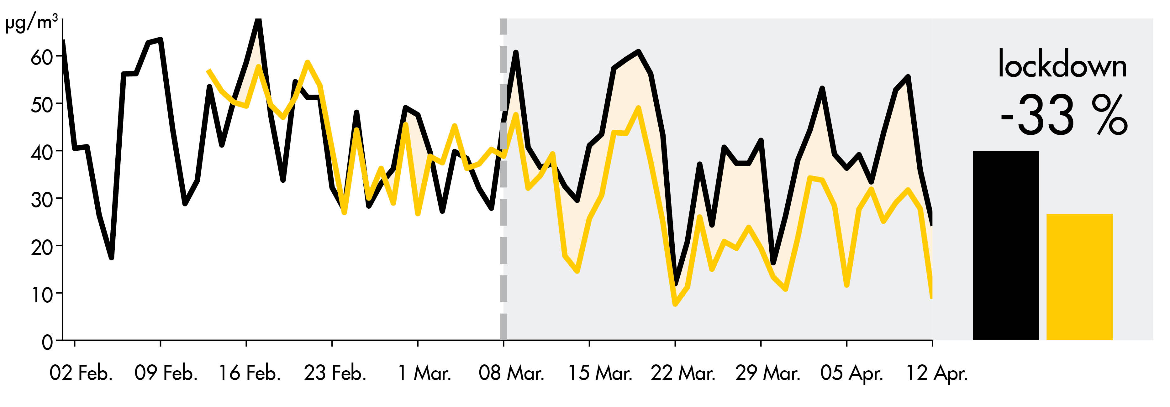
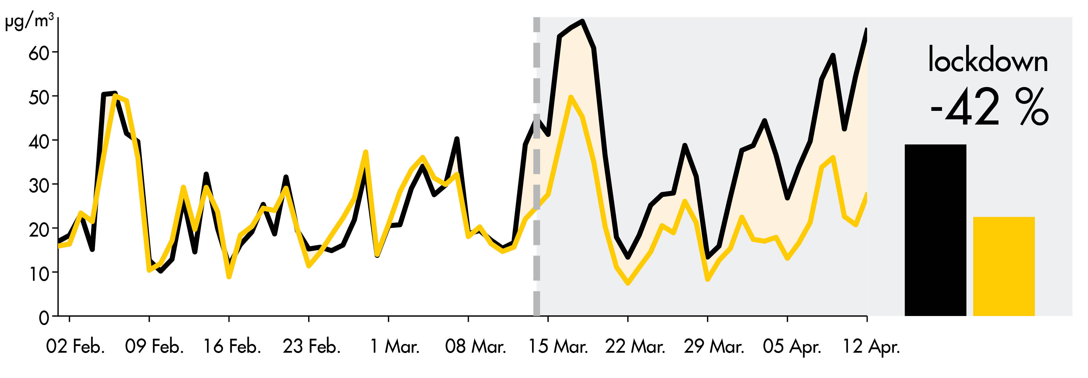
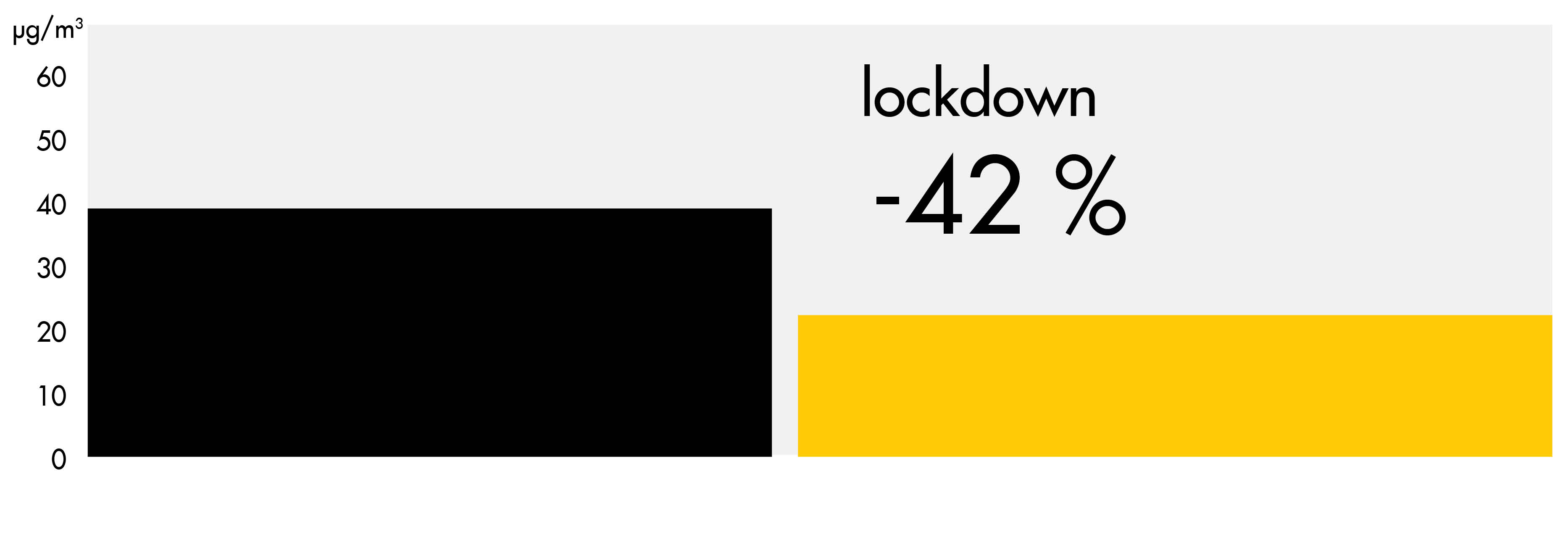
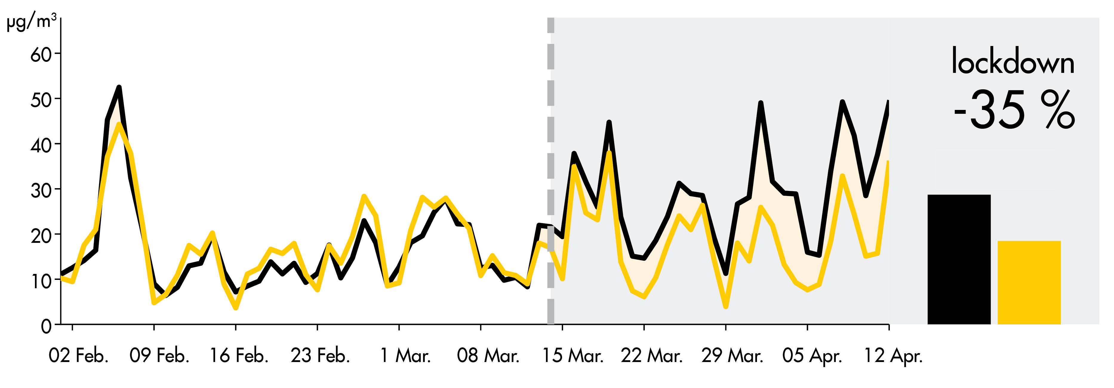
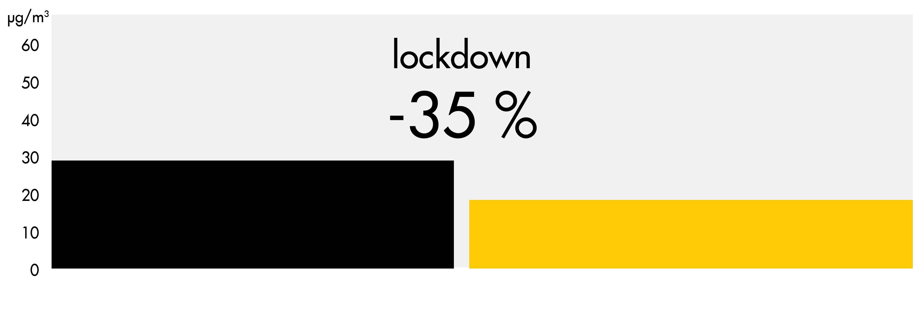
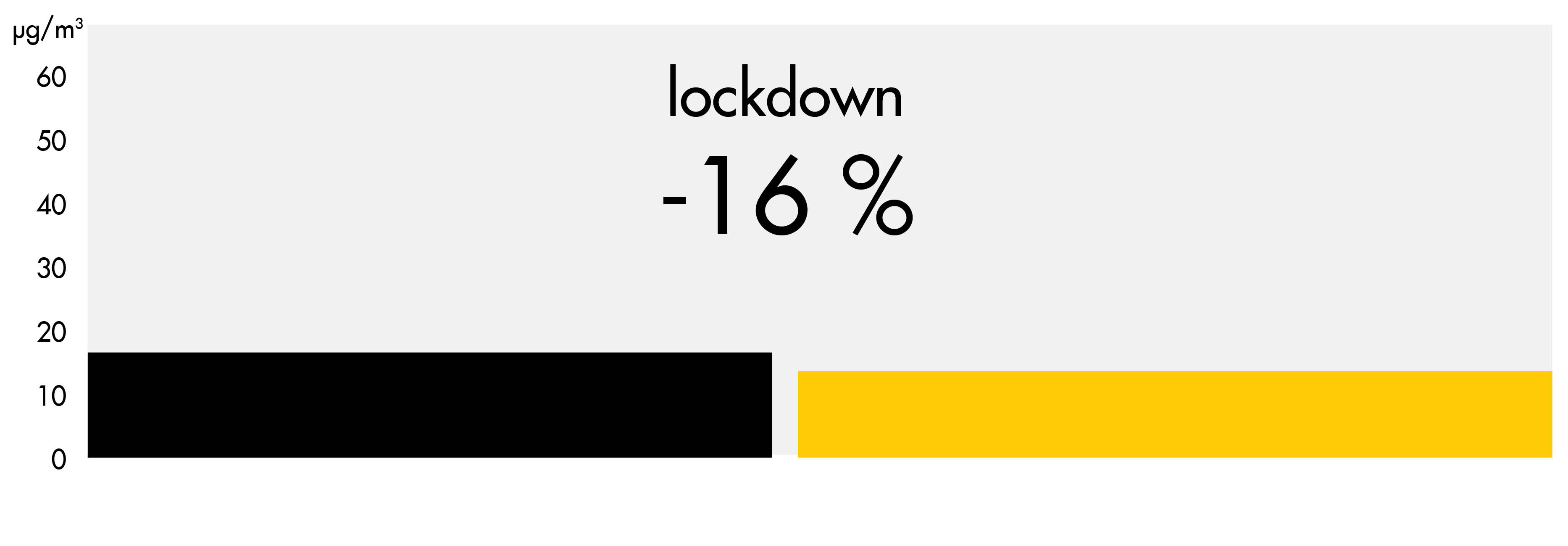
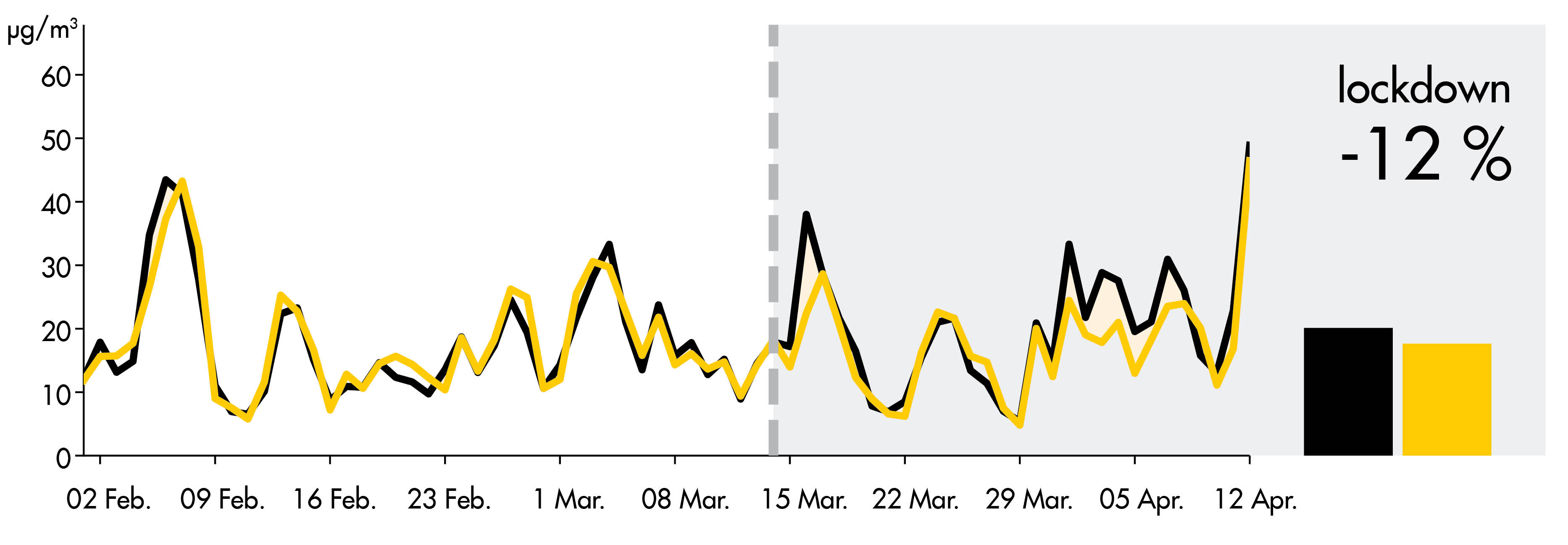
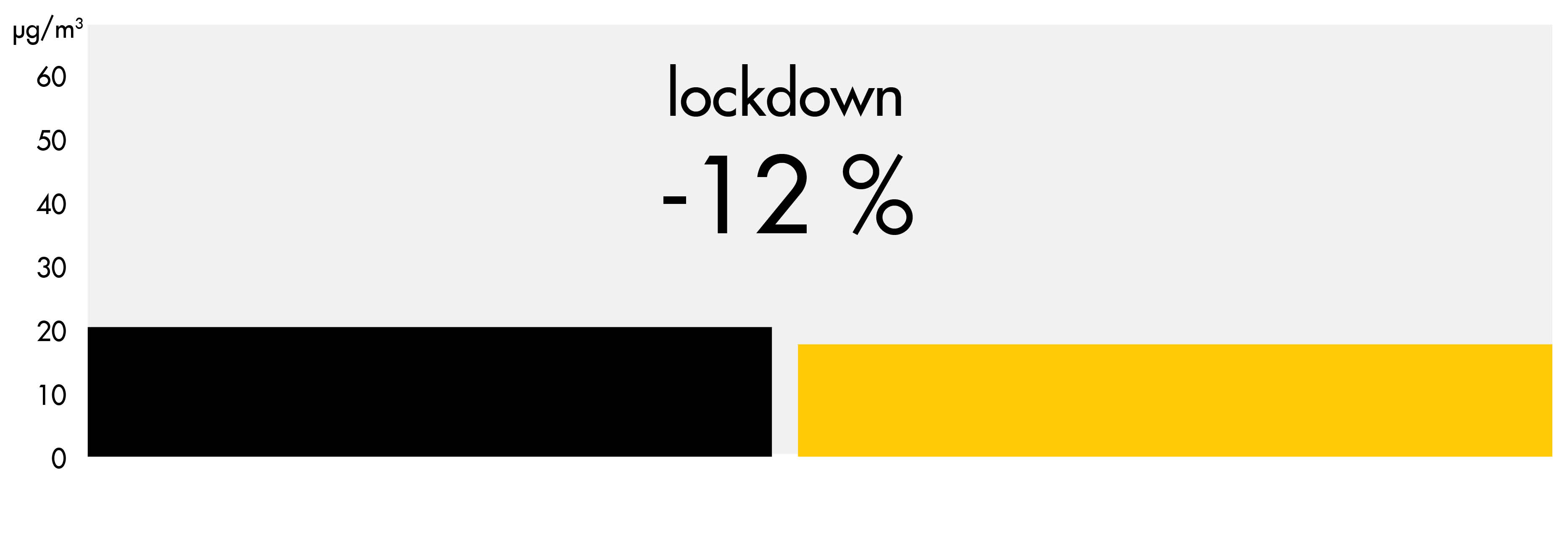
In order to understand the actual contribution of the lockdown regulations to the improvement of air quality, a comparison has been made between the NO₂ forecast which reflects the “Business as usual” emission scenario (Copernicus Atmosphere Monitoring Service forecast ensemble), and the measured urban background concentration. The black line shows the concentrations as they would be without any COVID-19 regulations, while the yellow line shows the actual measuremets from the reference network stations (Open Data Madrid, Government of Catalonia station network):
NO₂ in Madrid
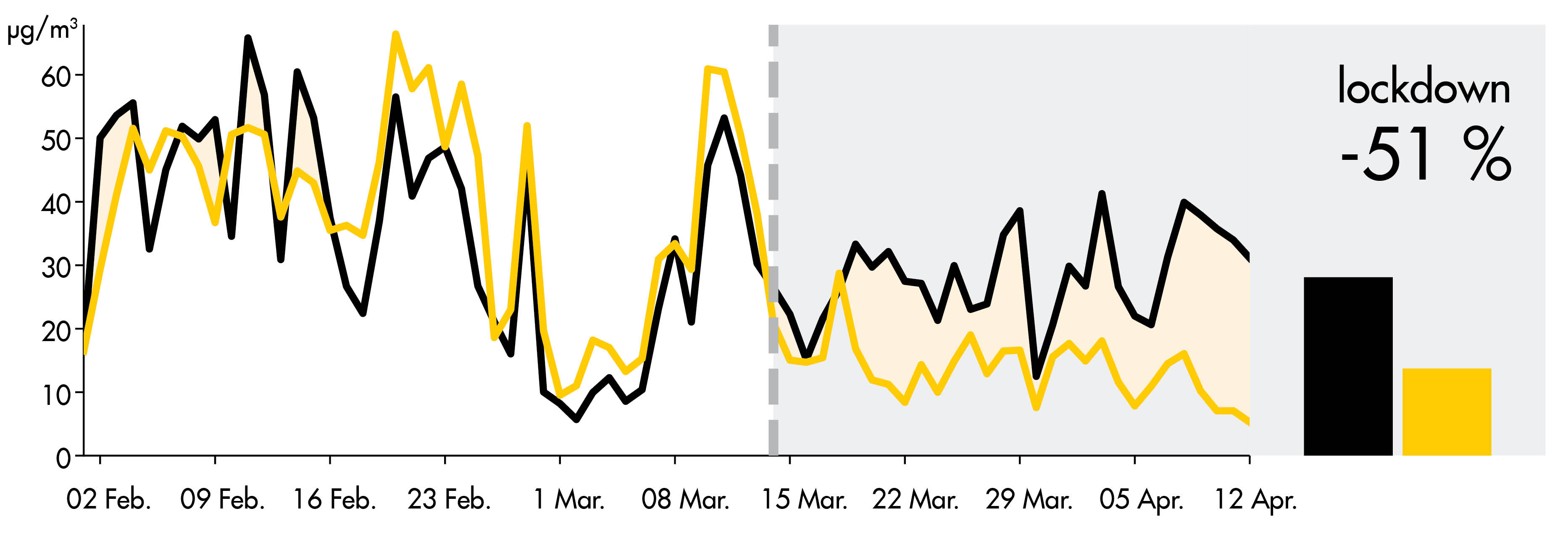
What does the Madrid graph show?Madrid presents a clear decrease of NO₂ in-situ concentrations with respect to those forecasted, and therefore it is reasonable to assume that the low levels of NO₂ pollution are greatly due to the lockdown restrictions. The shaded area shows the difference between the expected NO₂ concentration and real measurements. It suggests a reduction in NO₂ of over 40%.
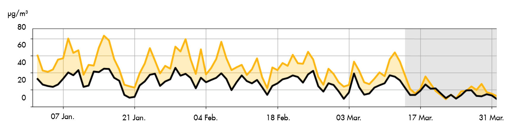
NO₂ in Barcelona
Credit: Bas Mijing, KNMI
What does the Barcelona graph show?The NO₂ concentrations in Barcelona are clearly low during the lockdown period. However, a strong decrease in pollution was expected anyway during the first days of the lockdown due to favourable meteorological conditions (i.e. rain, wind speed and direction). In the case of Barcelona, more data is necessary to make an accurate assessment of the influence of the lockdown in the overall NO₂ concentration decrease.
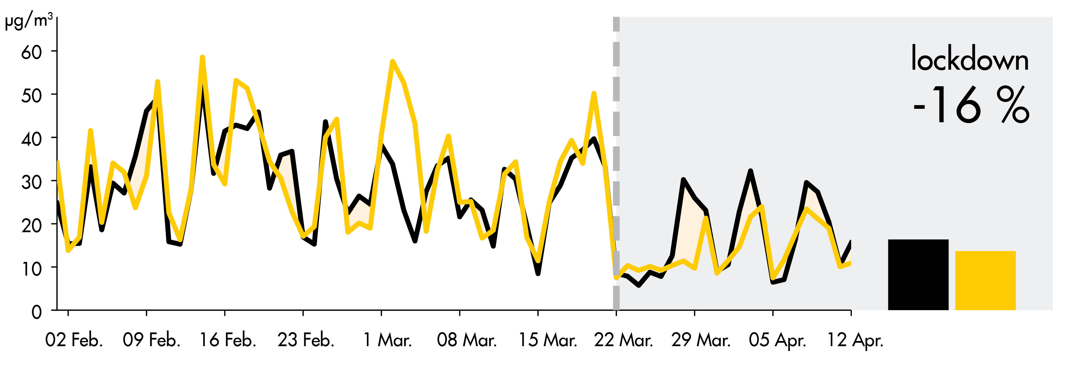
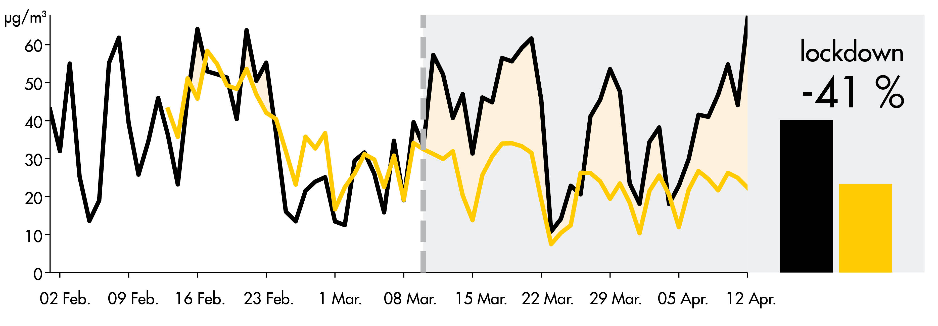
Barcelona: How do inner-city concentrations reduce with respect to background levels?
Effective measures will decrease the local contributions in air pollution (mainly traffic) so they will resemble more the background values. These can clearly be seen in the Eixample street station in Barcelona.
This graph shows that before the lockdown period, nearby traffic contributes around 20 µg/m³ (40%) to local NO₂ concentrations. This contribution almost disappears after March 14th when regulations are enforced.
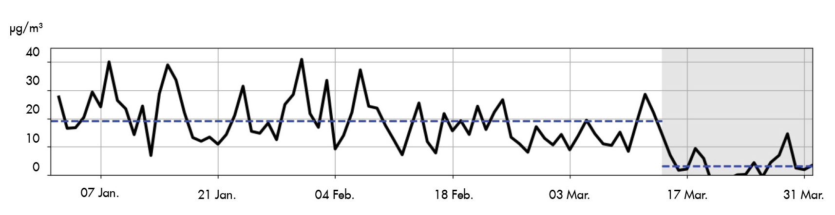
Credit: Bas Mijing, KNMI
What can be expected in other cities?
The following graphs show the same comparison for a number of selected cities, where the shaded areas represent significative differences between the NO₂ expected and the actual concentrations. Concentration reductions are especially visible for cities which would have high pollution levels without the lockdown measures (Milano, Madrid, Paris). In Barcelona, Berlin and Amsterdam the effect of the lockdown is not visible; these cities would have had clean air anyhow in the last couple of weeks.
NO₂ in Milan

NO₂ in Paris
NO₂ in Brussels
NO₂ in Bucharest
NO₂ in Amsterdam
NO₂ in London


NO₂ in Rome

Credit: Bas Mijing, KNMI
For professionals:
We are a small company located in Barcelona, in love with satellites, computers, scientific communication and our planet. We process and publish air quality and climate data. If you are interested and want to learn more, please contact us at info@lobelia.earth.
License and credits
This content is licensed under the Open Database License (ODbL). Any rights in individual contents of the dataset are licensed under the Database Contents License (DbCL). This content contains modified Copernicus Service information and OpenStreet Maps (© OpenStreetMap contributors).
Use the following attribution:
Content created by Lobelia Earth and KNMI.
Links to both websites are indispensable. For mentions on Twitter use the @lobeliaearth and @KNMI accounts.
Commercial use may be notified by e-mail to: info@lobelia.earth
In a nutshell, this means that you are free:
To share: to copy, distribute and use the database
To create: to produce works from the database
To adapt: to modify, transform and build upon the database
As long as you:
Attribute: You must attribute any public use of the database, or works produced from the database, in the manner specified in the ODbL. For any use or redistribution of the database, or works produced from it, you must make clear to others the license of the database and keep intact any notices on the original database.
Share-alike: If you publicly use any adapted version of this database, or works produced from an adapted database, you must also offer that adapted database under the ODbl.
Keep open: If you redistribute the database, or an adapted version of it, then you may use technological measures that restrict the work (such as DRM) as long as you also redistribute a version without such measures.